
Your brochure looks right on screen. The type is clear, the photos work, and the layout is finished. Then someone asks which paper you want.
The answer affects more than how expensive the piece feels. Will reverse-side printing distract from the text? Will a worksheet accept a pencil? Will a folded brochure close neatly? A paper that works beautifully for one of those jobs may be a poor choice for another.
Start with the label: pound weight needs a paper category, GSM measures mass per area, and caliper measures thickness. For double-sided printing, also evaluate opacity. Those are separate checks, and none can replace seeing how your actual design prints.
Why 80 lb text and 80 lb cover are different papers
Text stocks are commonly used for pages and folded pieces; cover stocks are commonly used for covers and cards.
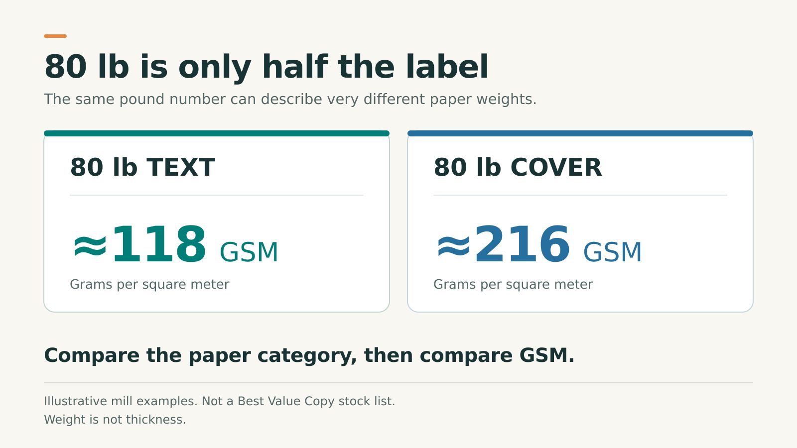
The “lb” or “#” on a paper label refers to basis weight. In the U.S. system, that means the weight of 500 sheets at the standard basic size for that paper category. Text and cover use different basic sizes. So do bond and index.
That is why comparing “80 lb” with “80 lb” is incomplete. You need the word that follows the number. The label also does not tell you what a ream of 500 letter-size sheets weighs. Mohawk's Paper Basics guide explains the category-based system.
These published mill specifications show the difference:
| Paper label | Approximate GSM | What the comparison tells you |
|---|---|---|
| 80 lb text | 118 | The text and cover labels use different scales. |
| 80 lb cover | 216 | The same pound number can represent much more mass per equal area. |
| 110 lb index | 199 | A larger pound number can still have a lower GSM than 80 lb cover. |
The text and cover figures come from Neenah's Conservation specifications; the index figure comes from Neenah's Exact stocklist. These are mill examples, not a list of Best Value Copy stocks. They compare weight, not thickness, stiffness, or quality.
When requesting a quote or comparing options, use the complete stock name. “80 lb glossy cover” gives the printer much more useful information than “80 lb paper.”
GSM, thickness, and stiffness answer different questions
GSM means grams per square meter, also written g/m². Because the reference area stays the same, it is useful for comparing paper weights across categories. A higher GSM means more mass for the same sheet area. It does not specify how thick that sheet will be.
Caliper is the measurement to look for when thickness matters. In paper specifications, one point equals 0.001 inch, so a 10 pt stock is approximately 0.010 inch thick. These are paper points, not the points used to size your type. OKI's paper-weight explanation covers the measurement systems.
| If you need to know… | Look at… | Then check… |
|---|---|---|
| How much equal-size sheets weigh | GSM | The finished quantity and format |
| How thick the sheet is | Caliper | A physical sample or the stock's specification |
| How firmly it resists bending | Stiffness | A sample cut to the finished size |
| Whether reverse-side printing distracts | Opacity | Your actual double-sided artwork |
| Whether the surface suits the job | Finish | Reading, writing, and handling in use |
There is no universal GSM-to-thickness conversion. For example, Mohawk's published 2018 Options specifications list two 118 GSM papers at approximately 5.1 and 6.1 points, depending on the finish. The same weight produced different thicknesses. This is a documented mill example, not a current BVC offering. See the Mohawk specification table.
Choosing paper for double-sided printing
If you can see a dark image from the back of a page while reading the front, opacity needs attention. Simply asking for “better paper” leaves the problem vague. Tell your printer that reverse-side artwork is interfering with reading.
Visible reverse-side printing does not automatically mean ink has bled through. RISE, a research and testing institute, distinguishes show-through associated with opacity from strike-through associated with ink penetration. The distinction matters when diagnosing the problem. Read RISE's explanation of print-through.
There is no single GSM that guarantees an acceptable result for every double-sided design. A mostly white document and a brochure filled with dark photographs ask different things of their paper.
Use the most demanding page pair in your file as a test. A useful example is small black text on a white background with a dark photograph directly behind it. If that combination reads comfortably, you have learned more than you would from an unprinted sheet.
View the sample under normal reading light, in the way people will use it. A loose flyer, a page resting on a desk, and a page inside a bound book are different situations. Holding a sheet against a bright lamp can be useful for inspection, but it is not the everyday reading test.
If the reverse side distracts, compare another stock or adjust the layout. Moving a large dark block away from a lightly printed reading area may help. Proof that change before committing to the full run.
Match the paper to what the piece must do
Handouts, worksheets, and reference packets
Start with readability and use. Will someone skim the sheet, keep it in a binder, or write on it during a class? A worksheet needs a surface that works with the intended pencil or pen. A reference packet also needs pages that turn comfortably.
For a double-sided packet, test reverse-side visibility before upgrading every page on feel alone. Compare the assembled packet, too: an appealing single sheet may create more bulk than you want when repeated throughout a long document.
Once you know the requirements, compare the paper options for your color-copy project.
Folded brochures
A brochure's paper must work after folding. Ask about the intended fold before settling on a stock, especially if you want a substantial cover-weight piece or dark artwork crossing a fold.
Grain direction, paper construction, coating, and scoring or creasing can affect the result. Sappi's technical guidance explains why heavier coated papers need particular attention to cracking at folds. That is a reason to discuss the job with the printer, not a guarantee that every folding method or preparation is available. See Sappi's guidance on fold endurance.
For brochure printing, confirm that your paper and fold work together. Review a folded sample when the fold is central to the design.
Booklets and workbooks
Choose the inside pages and cover as two decisions. The interior must suit reading, page turning, and any handwriting. The cover has a different handling job.
Start with the interior requirement, then compare a separate cover if the product supports it. Before ordering, confirm the stock combination with your page count and binding. A sample stack can help you decide whether the finished piece feels comfortable or unnecessarily bulky.
Our booklet printing guide goes deeper into covers, page counts, and binding choices.
Cards and other pieces people keep
A card is handled differently from a page in a booklet. Compare candidates at the finished size and think about how the card will be stored, passed around, or written on.
If someone needs to write an appointment time or a note, test the intended writing tool on the actual surface. A stock name alone cannot answer that question. For appearance and surface choices, see our matte vs. glossy printing guide.
How to read Best Value Copy's paper options
Use the complete stock names in BVC's paper information and suggestions. The guide lists these examples:
| BVC's published stock name | A useful starting point for comparison |
|---|---|
| 20# White Bond | Basic documents; check dense double-sided artwork carefully. |
| 24# Opaque Laser Bond and 28# Opaque Laser Bond | Compare with basic bond when evaluating a reading packet. |
| 32# Glossy Text Bond | Consider when a glossy text sheet suits the project. |
| 65# Laser White Cover | Compare when the job needs a separate paper cover or card-like piece. |
| 80# Glossy Cover and 100# Glossy Cover | Compare when both a glossy surface and cover stock suit the design. |
These are starting points from the published guide, not a promise that every stock is available with every size, fold, or binding. Check the choices for your selected product and configuration.
Use the exact names when asking questions. For “32# Glossy Text Bond,” ask BVC for GSM instead of applying a generic conversion.
Likewise, “Opaque” in a stock name is not a guarantee that no reverse-side image will be visible. Evaluate the artwork you intend to print.
A practical paper test before you order
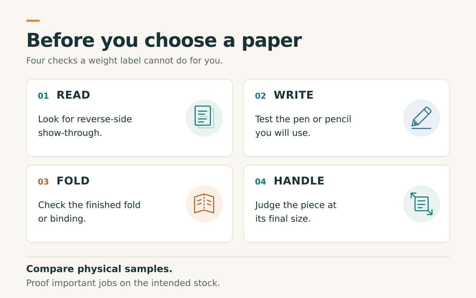
- Define the job. Write down the finished size, page count, printing sides, fold or binding, and whether anyone will write on it.
- Compare physical samples. Request BVC's free paper sample book to compare feel and surface. Shortlist the stocks that fit the product.
- Test the hardest artwork. Ask about a printed proof using the intended stock and your actual file, especially dark reverse-side artwork behind a lightly printed reading area. A PDF proof cannot demonstrate paper feel or show-through.
- Check the finished behavior. Write on it, fold it as intended, or gather sheets to judge the assembled piece. For production folds and binding, confirm compatibility with the printer.
- Compare the complete order. Review paper, quantity, finishing, delivery requirements, and the resulting quote together. Spend on the property that solves your actual problem.
BVC's color-copy ordering information offers a sent paper proof and notes that it delays production. Build that time into your plan and confirm the proof arrangement for your project. A sample book helps you choose a material; an artwork-specific proof helps you evaluate the printed result.
If accurate color is the main concern, also read why printed colors can differ from your screen. Paper selection is one part of that decision.
Paper weight questions
Is 80 lb text the same as 80 lb cover?
No. Text and cover use different basis-weight scales. Published mill examples put 80 lb text near 118 GSM and 80 lb cover near 216 GSM. Compare the category as well as the pound number.
Does higher GSM mean thicker paper?
Higher GSM means more mass per square meter. It does not specify thickness. For thickness, check the stock's caliper or compare physical samples; there is no universal GSM-to-point conversion.
What paper weight should I use for double-sided printing?
There is no single weight that guarantees acceptable show-through for every design. Compare suitable stocks with your actual artwork, especially dark printing behind light reading areas, and judge the result under normal reading conditions.
Should a booklet use the same paper for its cover and inside pages?
It can, but it does not have to. Choose the interior for reading and any writing, then decide whether a separate cover serves the project. Confirm the combination with the product's binding and page-count requirements.
Can a paper sample book replace a printed proof?
A sample book helps you compare materials. It does not show how your own artwork will print on them. For a demanding design, ask about a proof on the intended stock and allow time to review it.
Choose paper with the finished piece in mind
Keep the stock name, the design, and the finished format together when you order. That makes it easier to ask a precise question: “Will this paper work for a double-sided workbook people write in?” is more useful than “Which paper is best?”
Start with BVC's paper sample book, then review the paper guide alongside your product's available options. Choose the stock that makes your design work in someone's hands.


