
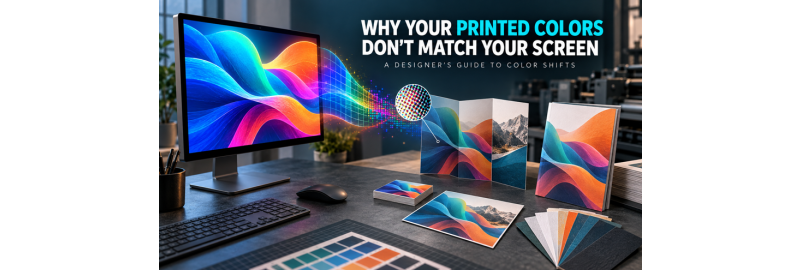
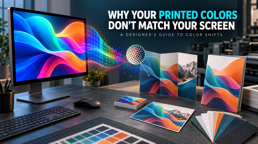
The blue on your monitor looked electric. The printed blue leans purple. The black background that felt deep and polished on screen looks more like charcoal on paper. Nothing is necessarily “broken.” A screen and a printed sheet create color in fundamentally different ways, and every conversion, profile, paper, proof, and viewing condition influences what reaches your eye.
The short answer is this: a monitor emits RGB light, while a printed piece reflects light from ink or toner on a physical surface. Their color ranges do not match, and neither device can reproduce every color the other can show. A color-managed workflow can make the result more predictable, but it cannot turn standard CMYK printing into a backlit display.
The goal, then, is not to make paper glow. It is to make informed color decisions before the file reaches production.
First, diagnose the kind of mismatch you are seeing
Different symptoms point to different causes. “The color is wrong” is not specific enough to solve the problem.
| What you see | Likely cause | What to check first |
|---|---|---|
| Neon green, hot pink, or electric blue becomes muted | The RGB color is outside the printable CMYK gamut | Soft proof with the intended output profile and adjust the color deliberately |
| A saturated blue shifts toward purple | The converted blue contains more magenta than expected, or the source and destination profiles were not handled as intended | Inspect CMYK values, profile assignments, and the exported PDF |
| A large black background looks gray or weak | The area may use only 100% black, or the paper/profile produces a lighter black point than the monitor | Ask for the printer’s approved rich-black build and total ink limit |
| Small black text looks fuzzy or shows colored edges | Rich black or registration color may have been used for fine type | Use the printer’s recommended black-only build for small text and rules |
| Photographs print darker than expected | The monitor may be too bright, shadow detail may be outside the print condition, or the proof was viewed in different light | Calibrate/profile the display and soft proof with paper and black simulation |
| The same file looks different on two papers | Paper color, coating, texture, and ink or toner interaction changed the reflected result | Compare samples or proof on the intended stock |
| Gradients show bands or transparent areas change | Conversion, flattening, compression, low bit depth, or blending-space choices may have altered the artwork | Inspect the exported PDF at high magnification and use Output Preview |
More than one cause can be present. A bright RGB blue placed in a transparent gradient, exported without the intended profile, and printed on warm uncoated paper has several opportunities to move.
RGB and CMYK are doing different jobs
RGB is an additive color model. A display combines red, green, and blue light, adding light until the result approaches white. That light is projected directly toward your eyes.
CMYK is a subtractive model. Cyan, magenta, yellow, and black colorants absorb portions of the light that falls on the printed surface. The color you perceive is the light reflected back from the ink or toner and the paper beneath it.
That distinction explains why screen color often feels more luminous. A monitor can produce intense blues, greens, pinks, and other highly saturated colors by emitting light. Standard four-color printing has to approximate those colors with physical colorants on a reflective substrate.
Adobe describes each device as operating within its own color space, or gamut, and notes that color can shift because of software definitions, image sources, print media, monitor differences, and other production variables. Its color-management overview is useful here because it makes a point that gets lost in many simplified explanations: RGB and CMYK are color models, not single universal color spaces.
An sRGB image, an Adobe RGB image, and a Display P3 image are all RGB, but the numbers in those files do not have the same meaning without their profiles. The same is true of CMYK spaces built for different printing conditions.
Why CMYK can look duller than RGB
When a source color is outside the destination gamut, it cannot be reproduced exactly. The color-management system has to map it to a printable alternative. Depending on the profiles and rendering intent, that alternative may be less saturated, less luminous, or slightly different in hue.
Canva’s current print-color guidance identifies electric blues and hot pinks as examples of colors that can fall outside CMYK gamut, and warns that neon-like RGB colors may print softer or more muted. The same risk applies broadly to highly saturated greens, cyans, purples, and oranges. The exact problem colors vary with the RGB source space, CMYK destination profile, print process, and substrate.
This is why “CMYK looks dull” is only partly correct. CMYK is not a single small box containing a fixed set of dull colors. A specific print condition has a specific gamut. Some printable cyans or yellows may even fall outside a particular RGB working space. The real question is whether a source color is reproducible in the intended output condition.
Screen effects that standard CMYK cannot imitate
Some design effects depend on light itself:
- neon and fluorescent-looking colors
- extremely saturated screen primaries
- HDR highlights
- luminous glows and backlit gradients
- very deep shadows shown on a high-contrast display
Standard CMYK can translate the design, but it cannot reproduce the emitted-light effect. If a fluorescent, metallic, or brand-critical spot color is essential, ask whether the job supports a specialty or spot-color process. Do not assume that naming a swatch “Pantone” makes the ordered product a spot-color job. If the printer converts that swatch to process color, the result is still a CMYK simulation.
A color profile gives the numbers context
An ICC profile describes the relationship between a device’s color values and a device-independent reference. The International Color Consortium explains that profiles allow color-management systems to translate between devices, such as a display and a printer, while acknowledging that exact matching is not always possible.
Without a profile, “RGB 25, 110, 240” or “C100 M70 Y0 K0” is incomplete information. The numbers describe channel amounts, but the profile describes what those amounts are intended to mean in color.
Three profile mistakes cause a large share of avoidable confusion:
- The source profile is missing, so software has to assume what the numbers mean.
- The wrong profile is assigned, changing how the existing numbers are interpreted.
- Artwork is converted to a generic CMYK profile that does not represent the printer’s intended output condition.
Assign Profile and Convert to Profile are not interchangeable
In Photoshop, Assign Profile changes the interpretation of existing color values. It does not recalculate those values. The appearance can change substantially.
Convert to Profile translates the values so their appearance is preserved as closely as the destination gamut permits. Adobe’s 2026 profile documentation explicitly distinguishes these operations and recommends previewing the conversion.
If a file has the wrong or missing source profile, do not cycle through profiles until one “looks good.” Identify the actual source space if possible. Assigning a profile is a repair decision. Converting to a profile is an output decision.
Should you convert RGB artwork to CMYK before printing?
Sometimes, but not automatically.
Convert the file yourself when the printer requires CMYK, supplies or specifies the destination profile, and expects the supplied CMYK values to be preserved. In that workflow, converting and reviewing the result gives the designer control over gamut mapping and color corrections.
Do not convert blindly to whichever CMYK preset appears first. The ICC notes that some print systems accept RGB and perform their own managed conversion, while a premature or mismatched CMYK conversion can produce a worse result. Adobe’s own guidance also ties conversion to a specific destination profile, not merely to the letters C, M, Y, and K.
Before exporting a color-sensitive job, ask the printer:
- Do you prefer tagged RGB, CMYK, or a mixed-color PDF?
- Which RGB and CMYK profiles should be used?
- Will embedded profiles be honored, ignored, or replaced?
- Which PDF preset or PDF/X standard do you want?
- What is the maximum total ink coverage?
- What black build should be used for large solids?
- Do you support true spot colors for this product?
Until BestValueCopy publishes those answers for its own workflow, this article should not prescribe a universal BVC CMYK profile or conversion setting.
Your monitor may be giving you false confidence
A vivid display can make almost any artwork look impressive. That does not make it an accurate reference for print.
Monitor calibration adjusts a display toward known target behavior. Profiling measures the display and creates a description that color-managed software can use. For color-critical work, both matter. A factory preset, “vivid” mode, night-light setting, automatic brightness feature, or unprofiled wide-gamut display can all make design decisions less reliable.
Screen brightness is especially deceptive. If the monitor’s white is much brighter than the paper under your viewing light, you may darken the image to make it look right on screen. The resulting print can then look too dark.
Ambient light matters too. Adobe recommends a stable light level and color temperature for color evaluation and notes that wall color, sunlight, fluorescent lighting, and even colorful reflections can influence perception. A print judged beside a warm lamp may appear different under daylight or a neutral viewing booth.
Practical steps:
- Turn off display modes that intentionally alter color or brightness.
- Use a hardware calibration device for color-critical, recurring work.
- Recalibrate on a sensible schedule for the display and workload.
- Keep room lighting stable while making print decisions.
- Compare prints under a known viewing condition, ideally neutral light.
- Do not use a phone screen as the final color reference.
Calibration improves prediction. It does not expand the printer’s gamut or make the monitor and paper physically identical.
Soft proofing is the bridge between the two media
A soft proof uses profiles to simulate a specific output condition on a color-managed display. In Photoshop, Illustrator, and InDesign, the basic path is View > Proof Setup, select the intended proof profile, then turn on Proof Colors.
Adobe’s soft-proofing documentation recommends a custom setup for the intended output condition and provides options to simulate paper color and black ink. Those two options often make the preview appear less brilliant, which is precisely the point. The preview is trying to represent reflective paper and the output’s black point rather than the monitor’s glowing white and darkest black.
A reliable soft proof depends on:
- an accurate display profile
- the correct output profile
- color-managed software
- appropriate rendering settings
- stable ambient lighting
It still cannot show paper texture, gloss, fluorescence, metallic effects, surface scatter, or every production variation. Adobe also cautions that a soft proof alone does not fully preview all overprinting behavior without the appropriate overprint preview.
Paper is part of the color system
The unprinted sheet is not empty. It is the design’s white point.
A bright, cool-white coated stock and a warm, uncoated sheet will not reflect the same light. The same colorants placed on those papers can therefore appear different. Paper brightness, whiteness, shade, coating, texture, opacity, and fluorescence can all influence the result.
Coated stocks generally keep colorants nearer the surface and provide a smoother printing surface. That can make images appear sharper and colors feel more saturated. Uncoated stocks usually scatter and absorb more light, which can soften contrast and saturation. That softer result may be exactly right for an editorial, natural, or tactile design. It is not automatically lower quality.
Gloss and matte coated papers can reproduce color similarly while creating different visual impressions because gloss reflects more directional light and matte reduces glare. For a fuller finish comparison, see BestValueCopy’s matte vs. glossy printing guide.
When paper color matters, a physical sample is more useful than a stock name. “White” is not one color, and screens cannot reproduce surface feel or reflected-light behavior. BestValueCopy publishes a paper information guide and offers a paper sample book request for comparing available stocks.
Why blue sometimes prints purple
Many process blues rely on both cyan and magenta. If the magenta contribution becomes too strong relative to cyan, the blue can move toward violet or purple. That relationship can be affected by the original color, profile conversion, gamut mapping, and output condition.
Start by asking four questions:
- Was the original blue out of gamut for the intended print condition?
- Did the file use the correct source profile before conversion?
- What CMYK values appear in the exported PDF, not just the working file?
- Was the physical sample evaluated on the intended paper and under neutral light?
For a brand blue, do not judge by a hex value alone. Define the approved print target with the printer, view a CMYK or spot-color reference under controlled light, and proof on the intended stock when the decision carries real cost.
Why printed black can look gray
On a monitor, RGB 0, 0, 0 can be displayed as the screen’s darkest black. On paper, the darkest printable black depends on colorants, substrate, profile, and print process.
Black-only, commonly described as 100% K, is often appropriate for small black text and fine rules because it avoids registration problems between multiple color separations. A large solid area using black alone may look less dense than a carefully constructed rich black that adds process colors beneath or alongside black.
There is no universal rich-black formula. The permitted build and total ink coverage depend on the printing condition and stock. Too much combined ink can create production problems in some processes. Adobe Acrobat’s Output Preview guidance tells designers to ask the print provider for the press limit and use Total Area Coverage warnings to identify excessive values.
Two safe rules follow:
- Use the printer’s specified black-only build for small type and thin lines.
- Use only the printer’s approved rich-black build for large solid areas.
Never use the Registration swatch as a design black. Registration color outputs on every separation and is intended for production marks, not artwork.
Photographs and vector artwork fail differently
Photographs contain many continuous tonal and color relationships. When a wide-gamut image is converted for print, a perceptual rendering may compress the relationships among colors so the photograph still feels natural, even though individual values move. The appropriate rendering intent depends on the image and workflow.
Flat vector artwork behaves differently. A logo may contain only a few exact brand colors, so even a small hue shift is obvious. Relative colorimetric handling may be appropriate for in-gamut flat colors, but there is no one setting that is best for every file. The output profile and printer specification remain decisive.
This is also why one automated conversion may handle a photograph acceptably while producing an unsatisfying logo blue on the same page. Review color-critical vector swatches separately from photographic content.
Gradients, transparency, and blending can introduce a second shift
Not every apparent color problem begins with gamut. Transparency and blending combine colors mathematically before or during output. The result can change if objects use mixed color spaces, the transparency blend space is unsuitable, or live transparency is flattened for an older PDF workflow.
Gradients are vulnerable to banding when tonal steps are compressed, when a file is repeatedly converted, or when lossy export settings remove information. Adobe recommends dithering during profile conversion to help reduce gradient banding and warns that converting color modes changes values permanently.
For artwork with glows, shadows, overlays, opacity masks, or long gradients:
- keep an editable master
- avoid repeated RGB-CMYK-RGB conversions
- use the printer’s requested PDF compatibility or PDF/X preset
- inspect the exported PDF, not only the layout document
- turn on Overprint Preview or Output Preview where appropriate
- check gradient transitions at normal viewing size and high magnification
PDF/X is a family of print-exchange standards, not a magic quality switch. Adobe’s current InDesign help supports PDF/X export, while Illustrator’s PDF options explain that color conversion, output intent, overprints, fonts, and transparency depend on the chosen standard and compatibility. Use the version the printer asks for.
Practical workflows for Canva and Adobe users
Canva
Canva’s editor uses hex colors, but its current export options can include a CMYK color profile on supported paid, education, and nonprofit accounts. Canva identifies PDF Print as the print-oriented export, with 300 dpi output plus bleed, crop-mark, and RGB/CMYK profile options. These features and plan availability can change, so check the current export panel.
For a commercial print file:
- Build the design at the exact finished dimensions.
- Use print-safe colors rather than relying on neon-like screen colors.
- Turn on print bleed while designing and extend backgrounds through it.
- Keep text and logos inside the safe area.
- Download as PDF Print.
- Choose CMYK only if it matches the printer’s requested workflow.
- Include crop marks and bleed only when the printer requests them.
- Open the exported PDF and inspect every page before upload.
Canva’s file-type guide and bleed guidance are the current source for the interface. BestValueCopy’s own file specifications should take priority for a BestValueCopy order.
Photoshop
- Keep a layered master in the original working space.
- Confirm the embedded source profile.
- Use a custom soft proof for the intended output profile.
- Use Gamut Warning as a diagnostic aid, not as an automatic correction.
- If conversion is required, use Edit > Convert to Profile, then review the result.
- Do not use Assign Profile as a substitute for conversion.
- Save a separate output copy so the editable master remains intact.
Adobe notes that RGB-to-CMYK conversion permanently remaps out-of-gamut colors and that some details may not be recoverable. That is a good reason to delay irreversible conversion until the output condition is known.
Illustrator
- Set the document color mode according to the printer’s requested workflow.
- Use global swatches for brand colors so corrections remain controlled.
- Check whether any swatch is unintentionally defined as a spot color.
- Use Separations Preview and Overprint Preview.
- Inspect rich black, overprinting, transparency, and gradients.
- Export with the requested PDF preset and output profile.
Adobe’s separations guidance specifically recommends calibration, color settings, soft proofing, gradient checks, trapping awareness, and transparency review before output.
InDesign
- Preserve and inspect profiles in placed photographs and graphics.
- Avoid casually converting each asset to a different CMYK space before placement.
- Set the transparency blend space deliberately.
- Use Separations Preview and Overprint Preview.
- Export an Adobe PDF for print, not an interactive PDF.
- Apply the printer’s requested color-conversion policy and output intent at export.
- Use PDF/X only when its version matches the receiving workflow.
InDesign is often the best place to manage a mixed layout because photographs, vector artwork, text, and spot colors can remain distinct until a controlled output step.
Soft proof, digital proof, or physical proof?
The word “proof” can describe very different things. Ask what a proof is intended to verify.
| Proof type | Useful for | Does not necessarily prove |
|---|---|---|
| Soft proof on a calibrated display | Gamut shifts, approximate paper white and black point, relative color decisions | Texture, gloss, fluorescence, exact physical density, finishing, every overprint behavior |
| Online or emailed PDF proof | Page order, content, trim, obvious file problems, some separations if inspected in Acrobat | Contract-level color unless explicitly stated |
| Uncalibrated office print | Copy review and rough composition | Commercial color or paper behavior |
| Physical proof on a production-representative device and stock | The closest practical preview of physical color, paper, and contrast | Final-run identity unless the printer defines it as a contract proof and controls the production conditions |
If a color difference could force a reprint, delay a launch, or violate a brand standard, ask for a physical proof and ask whether it is color-representative, stock-representative, and contractually binding. A physical proof can add time, but that tradeoff is usually easier to accept before a large order than after it.
For products where BestValueCopy offers a paper proof, select that option when the physical result matters more than the fastest possible production. Confirm availability and timing for the specific product before ordering.
A designer’s preflight checklist for more predictable print color
Before uploading the final PDF:
A technically valid PDF can still produce unexpected color. Passing preflight means the file can be processed. It does not mean the monitor, output profile, paper, and design decisions are aligned.
When exact color matching is realistic
Exact visual identity between a glowing screen and reflective paper is not a realistic promise. Predictable, repeatable, and acceptably close reproduction is realistic when the workflow is controlled.
Expect better predictability when:
- the source and destination profiles are known
- the monitor is calibrated and profiled
- the soft proof uses the intended output condition
- the paper is selected before final color decisions
- brand-critical colors are defined with physical references
- the exported PDF is inspected
- a production-representative proof is approved
For a logo or brand color that must remain consistent across runs and substrates, ask whether a true spot-color workflow is available and appropriate. Process builds, Pantone-to-CMYK simulations, and different papers can all produce visibly different versions of “the same” named color.
Frequently asked questions
Why do printed colors look different from my screen?
Screens emit RGB light, while prints reflect light from physical colorants and paper. Their gamuts and black-and-white points differ, so some screen colors must be remapped for print. Profiles, monitor settings, paper, lighting, and proofing determine how predictable that remapping is.
Why does CMYK look duller than RGB?
Highly saturated RGB colors may sit outside the gamut of the intended CMYK print condition. They are converted to reproducible alternatives that can look softer or less luminous. Standard CMYK also cannot reproduce a display’s emitted-light glow.
How do I make printed colors match my monitor?
Calibrate and profile the display, work in color-managed software, use the correct source and output profiles, soft proof for the intended paper/print condition, and approve a physical proof when color is critical. The goal is a controlled visual match, not physical identity between two different media.
Should I convert RGB to CMYK before printing?
Only when the printer requests it or supplies a known CMYK workflow. Some printers prefer tagged RGB and perform the conversion for their output device. Converting to an arbitrary CMYK profile can discard color and make later correction harder.
What color profile should I use for printing?
Use the profile specified by the printer for the actual process and paper condition. There is no universal “best CMYK profile” for every commercial printer, stock, and product.
Why did my blue print purple?
Process blue commonly contains both cyan and magenta. An out-of-gamut original, incorrect profile handling, or a converted build with too much magenta relative to cyan can push the result toward purple. Inspect the exported PDF values and proof on the intended stock.
Why does my printed black look gray?
Black-only ink or toner on paper cannot always reach the darkness of a monitor. Large black areas may need a printer-approved rich-black build, while small text usually needs a black-only build for sharp registration. Always follow the printer’s total ink and black specifications.
Does paper change printed color?
Yes. Paper is the print’s white point, and its shade, coating, texture, brightness, and fluorescence affect reflected color, contrast, and saturation. Compare samples or a proof on the intended stock when the difference matters.
Can a printer reproduce every color I see on screen?
No. Every display and print condition has a limited gamut. Standard CMYK cannot reproduce every RGB color, especially neon-like and highly saturated screen colors. Specialty inks or other print processes may expand the possibilities, but availability is product- and printer-specific.
Better print color starts before upload
The biggest screen-to-print surprises usually begin earlier than the press: an unprofiled display, an unknown source space, a generic CMYK conversion, a paper choice made after the design is approved, or a PDF that was never inspected outside the design application.
Treat the monitor, file, profile, proof, and paper as one system. When those decisions agree, commercial printing becomes far more predictable.
BestValueCopy offers nationwide online printing for brochures, flyers, postcards, booklets, business cards, banners, and other printed materials. Before placing a color-sensitive order, review the available paper and proof choices for the product and contact BestValueCopy with any file-specific questions that are not answered in the published specifications.


